River groyne theme
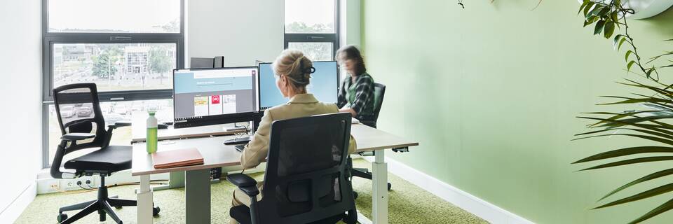
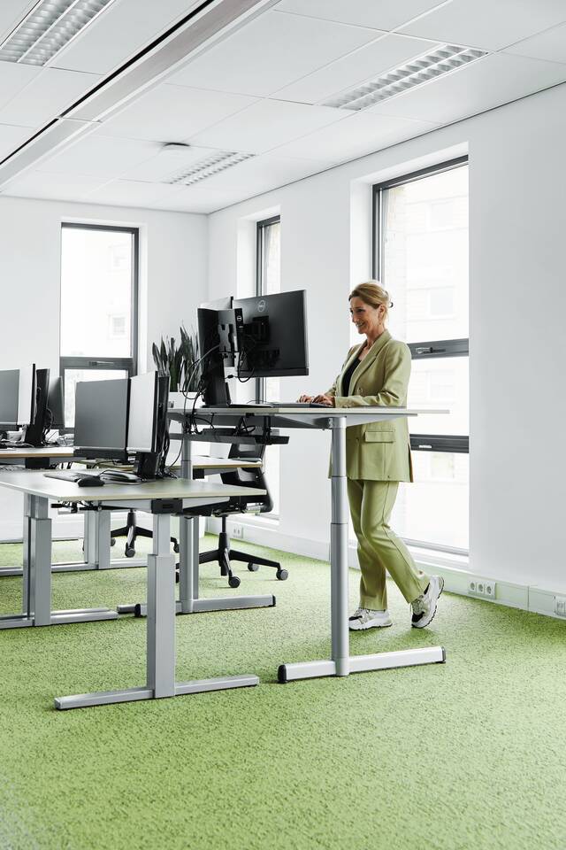
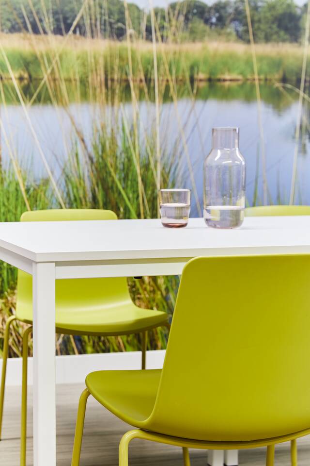
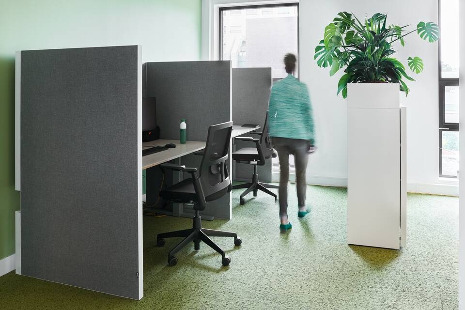
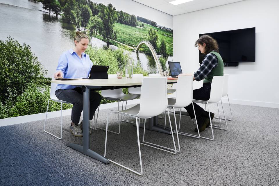
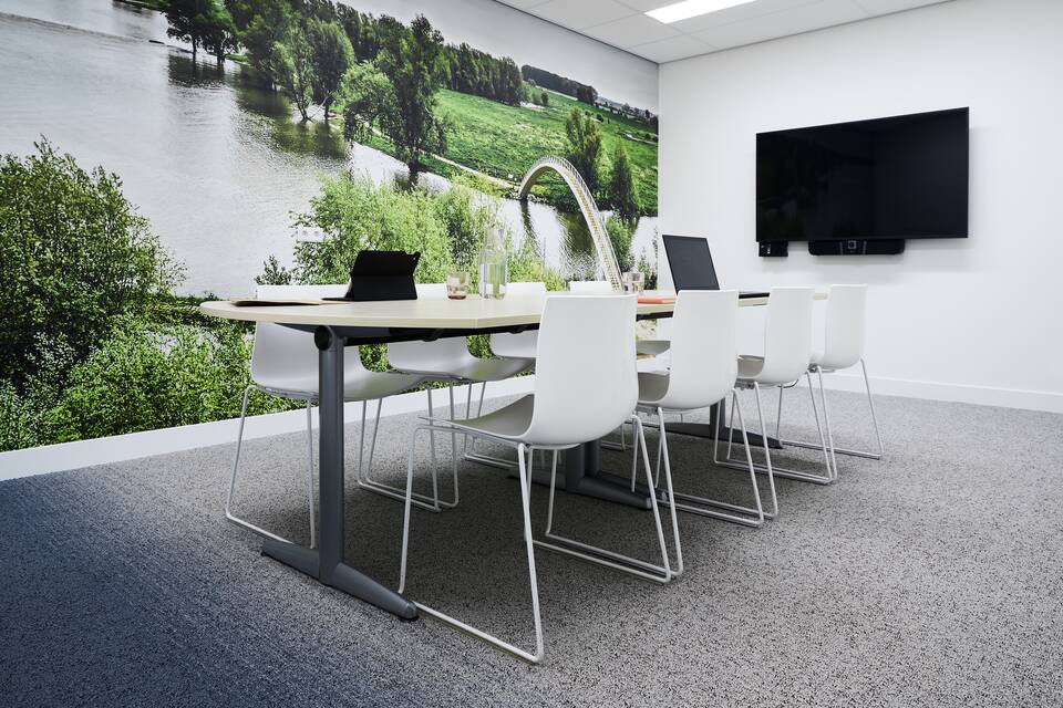
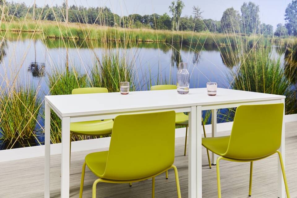
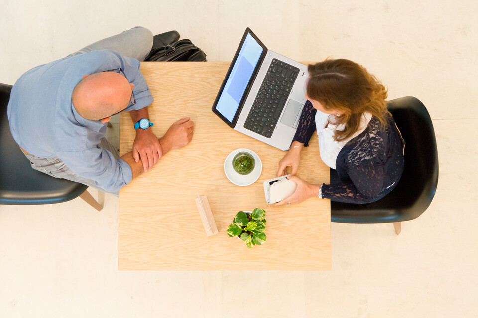
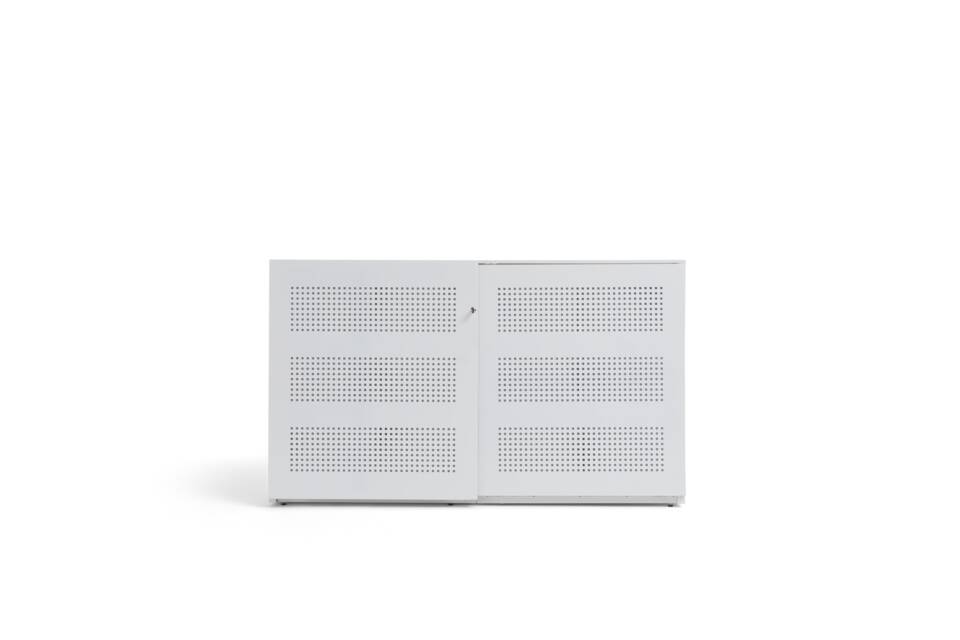
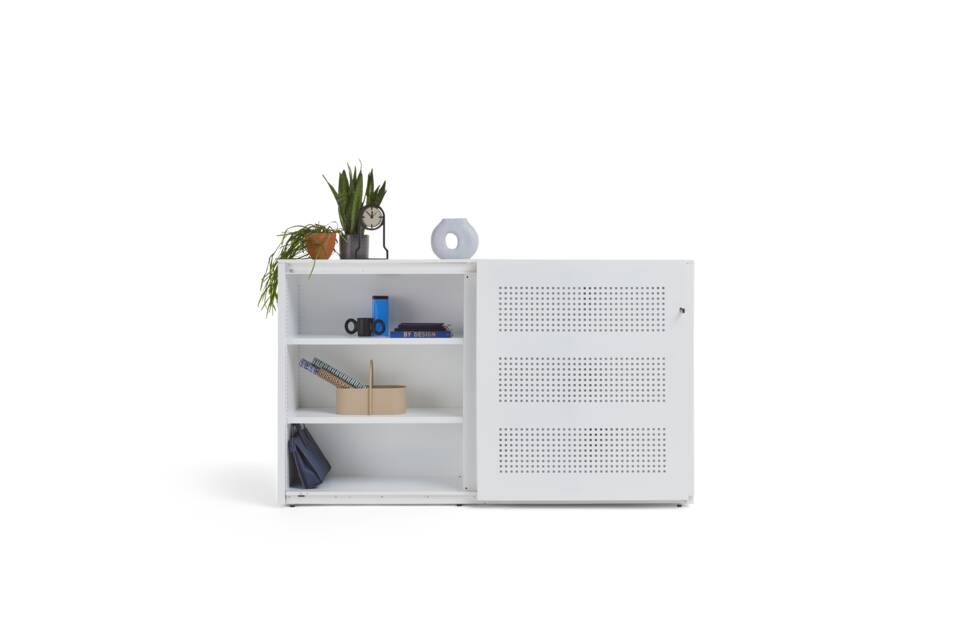
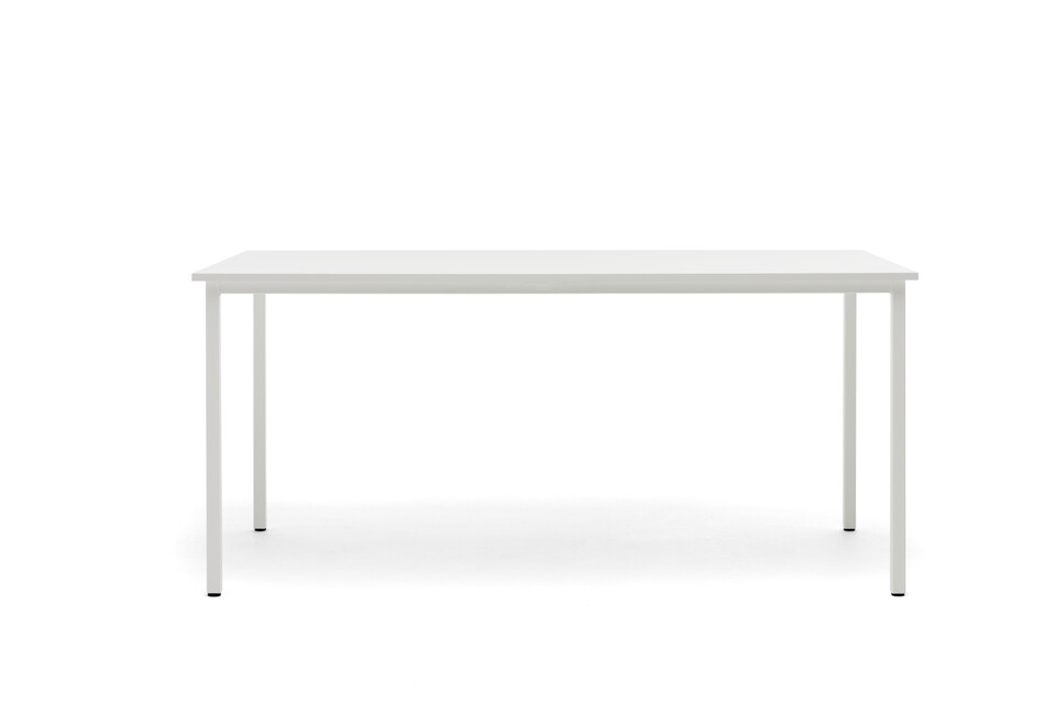
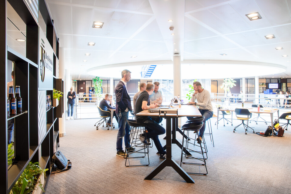
'We kept the theme close to the Nijmegen area: groynes along the Maas and Waal rivers. The interior design was to reflect a kind of river landscape,' Iris explains. 'Each office is basically a groyne along the river shore, with furniture to match. The corridors represent the rivers, and the carpet tiles slowly fade from blue into green. We photographed all kinds of bridges in the Nijmegen area and put up a picture of a different bridge in each office. It was important to us that the building forms a single entity.'
Precursor
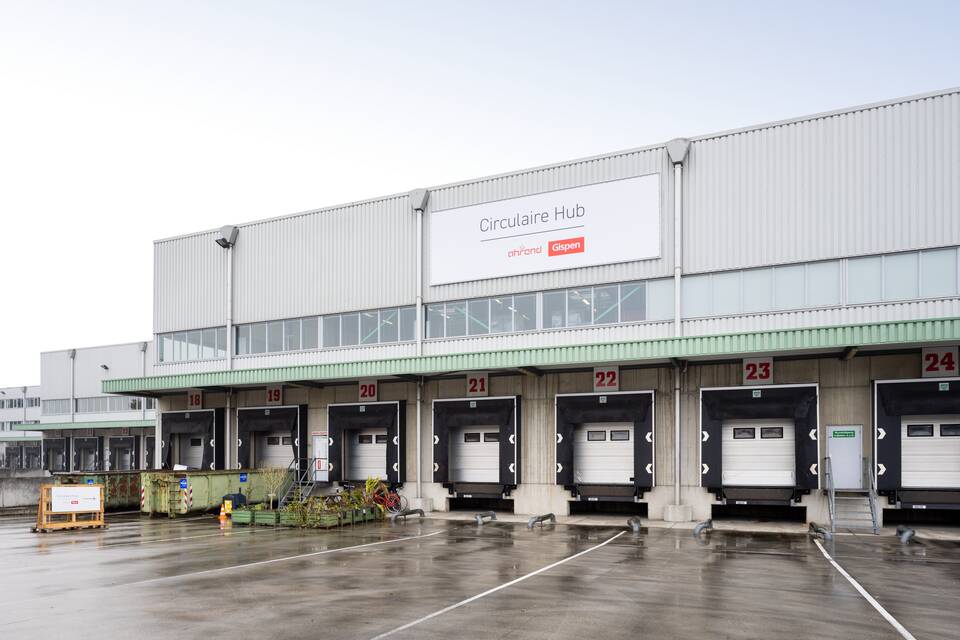
‘We had worked with Gispen before; to our great satisfaction,’ Iris explains. 'And we had run circular projects before, but never as comprehensive as this one. Gispen delved deep into our catacombs and found furniture and items we never knew existed. We had the furniture properly cleaned and had some items reupholstered. But that's about it. This is a precursor to how we will tackle other projects from now on. We have demonstrated that 100% circularity is possible.'
What do you think of the result?
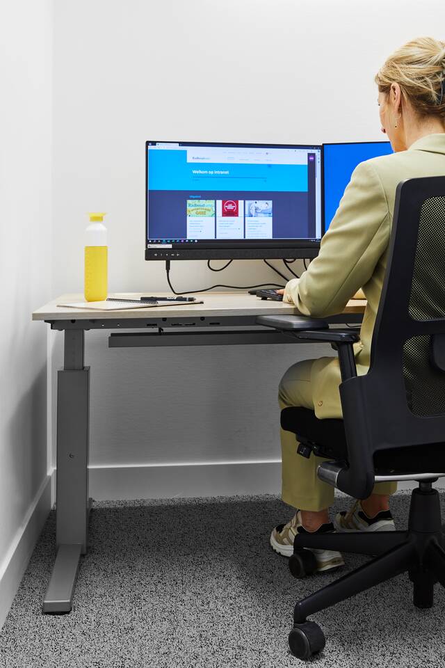
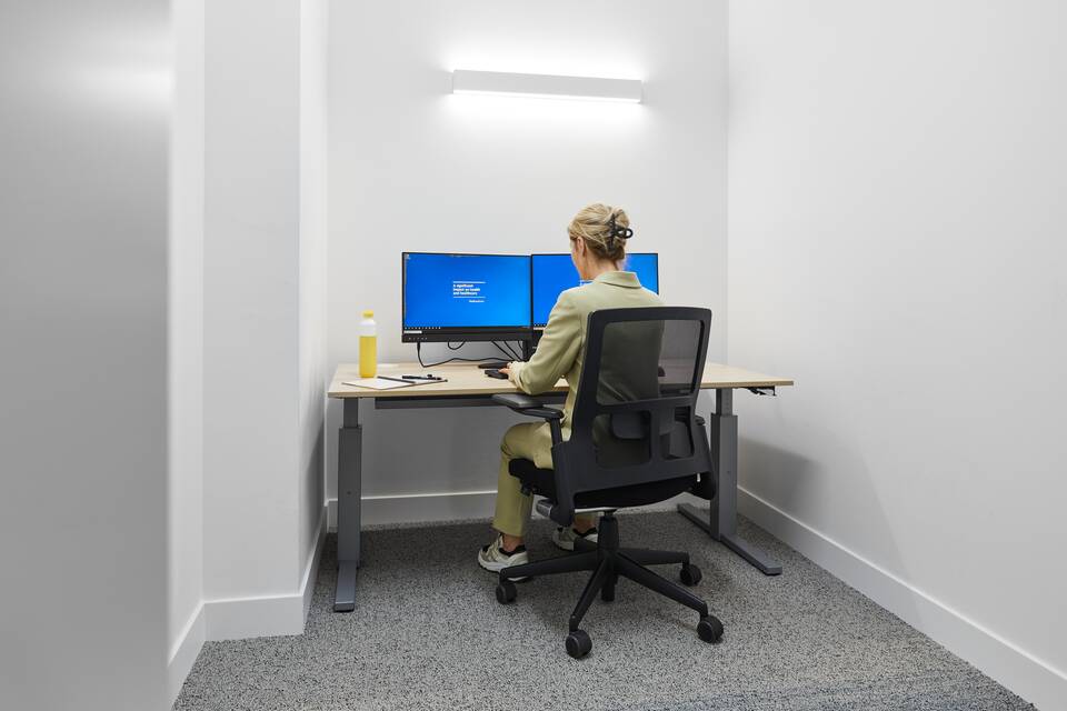
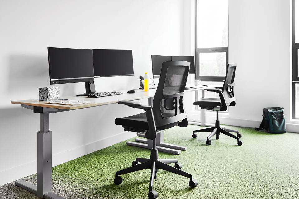
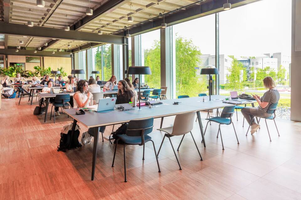
Iris: ‘The interior has obtained a high level of coherence, which is something everyone who comes here concurs with. Everything matches and flows nicely together. Circularity is sometimes perceived as something negative, as if it's all worn-out and second-hand stuff. This project proves the opposite. The director of Radboudumc made a visit the other day, and thought the entire interior was brand-new. That's the best compliment we could have received.'
Photography: Studio De Zwarte Kater
